The Role of Typography in Effective Visual Communication
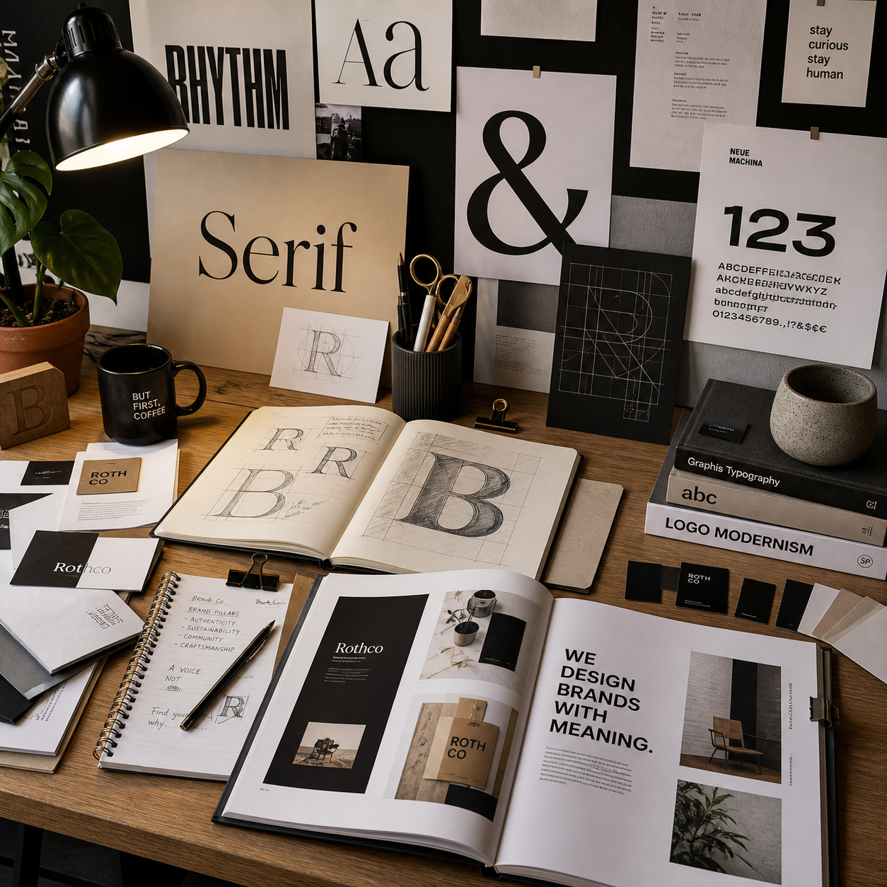
Typography gives written language a visual voice. The choice of typeface, font size, spacing, alignment, and contrast affects what people notice first, how comfortably they read, and what they believe about a brand or message. In effective visual communication, typography works alongside imagery, color, composition, and content to make meaning clear.
Why Typography Matters in Visual Communication
Typography matters in visual communication because it communicates information, tone, emphasis, and personality at the same time. A carefully chosen type system can make a message feel trustworthy, energetic, refined, urgent, or approachable before the audience reads every word.
Words carry literal meaning, but their visual treatment shapes interpretation. A formal serif typeface may support an editorial or institutional message, while a clean sans-serif font can suggest efficiency and modernity. A large display typeface can create impact for a campaign headline, yet become tiring when used for long paragraphs.
Typography also reduces the effort required to understand a composition. Clear headings, predictable spacing, and visible distinctions between labels and body copy help viewers scan a poster, website, presentation, or portfolio case study. Poor typography creates friction: the audience spends energy decoding the layout instead of engaging with the idea.
Think of typography as a communication system with three jobs:
- Clarify: make words readable and information easy to find.
- Direct: establish a visual path through the content.
- Position: express a brand’s character and intended audience.
These jobs often compete. A highly expressive typeface may strengthen mood but reduce legibility. A neutral font may improve clarity but require color, imagery, or layout to create distinction. Strong design decisions begin by identifying the communication problem before choosing a visual style.
Typography and the Principles of Visual Hierarchy
Typography creates visual hierarchy by changing size, weight, spacing, alignment, and contrast so viewers know what to read first, second, and last. A successful typographic hierarchy turns a collection of words into an ordered experience.
Hierarchy should reflect content importance. A portfolio project might use the largest type for the project title, a smaller weight for the design challenge, and compact body text for process notes. This structure allows visitors to understand the case study quickly, even when they initially scan rather than read closely.
Build hierarchy with deliberate variables
- Size: creates immediate emphasis and separates levels of information.
- Weight: distinguishes headings, labels, and supporting text without requiring a dramatic size change.
- Spacing: groups related elements and gives important content room to breathe.
- Alignment: establishes order and creates visual relationships across a page.
- Contrast: separates levels through differences in scale, color, weight, or type style.
Contrast works best when it has a purpose. A headline that is only slightly larger than body copy may disappear in a busy layout. Conversely, too many competing differences can make every element demand attention. Establish a small set of text levels, then test whether the intended reading order remains obvious when viewed at a distance or reduced to a thumbnail.
Alignment is equally important. A consistent left edge can connect headings, paragraphs, captions, and images across a grid. Center alignment can suit invitations or short statements, but long centered passages usually create uneven starting points that slow reading.
Choosing Typefaces for Meaning and Audience
Choose a typeface by matching its visual character and functional performance to the project’s audience, message, medium, and brand context. Serif, sans-serif, display, and variable typefaces can all communicate effectively when their roles are clearly defined.
Serif typefaces often provide a literary, established, or humanist tone, although the specific design matters more than the category alone. Sans-serif typefaces frequently support clean interfaces and contemporary identities, yet they can also feel warm, expressive, or institutional depending on their proportions and details.
Display typefaces are designed for attention at larger sizes. They can give a campaign, cultural event, or editorial cover a distinctive voice. Their trade-off is limited flexibility: an unusual display font may look compelling in a headline but perform poorly in navigation or dense explanatory text.
Variable typefaces allow designers to adjust axes such as weight, width, or optical size within a single font file. This can help a responsive identity adapt across a phone screen, poster, and presentation. It also introduces more decisions, so flexibility should serve a defined system rather than encourage arbitrary variation.
A practical typeface selection filter
- Describe the communication goal in one sentence, such as “make a public-service message calm and immediately understandable.”
- List the audience’s reading conditions: screen size, distance, viewing time, and expected attention.
- Test candidate typefaces using real project copy, including headings, numbers, captions, and long paragraphs.
- Check whether the typeface supports the required language characters, weights, and formats.
- Compare the typeface with the intended visual identity, imagery, color palette, and layout grid.
Do not select a font because it looks attractive in isolation. Test it inside the composition where its rhythm, width, counters, and word shapes become visible.
Readability, Legibility, and User Experience
Readability describes how comfortably people can follow extended text, while legibility describes how easily they can distinguish individual letters and words. Effective typography supports both by controlling font size, line length, leading, contrast, and responsive presentation.
Legibility depends on letterform features such as open counters, recognizable shapes, and sufficient distinction between similar characters. Readability depends on the larger arrangement: line length, paragraph spacing, hierarchy, and the relationship between text and surrounding elements.
Practical checks for comfortable reading
- Font size: choose a size that remains comfortable on the intended screen and at the expected viewing distance; body text should never rely on zooming for basic comprehension.
- Line length: avoid extremely wide text blocks, which make it difficult to locate the next line, and extremely narrow blocks, which create excessive line breaks.
- Leading: use enough line spacing to separate rows without making paragraphs feel disconnected.
- Contrast: check text against its actual background, including images, gradients, and colored surfaces.
- Responsive behavior: test how headings wrap, buttons expand, and navigation labels behave at different widths.
Accessibility should be part of the design review rather than a final repair. The Web Content Accessibility Guidelines provide widely used guidance for perceivable and understandable digital content, including text contrast and adaptable presentation.
There is no universal setting that guarantees good reading. A condensed typeface may work for a short navigation label but fail in a long article. A large headline may be accessible in a desktop mockup yet wrap awkwardly on mobile. Evaluate typography in context, across realistic content and devices.
Creating Harmony Through Font Pairing and Layout
Font pairing creates harmony when different typefaces have distinct roles but share enough structural or historical character to feel related. Layout then reinforces that relationship through grids, imagery, color, and negative space.
A reliable pairing often combines contrast with compatibility. For example, a restrained sans-serif can support a distinctive serif headline, while a neutral text face handles captions and interface labels. The difference creates hierarchy; shared proportions, x-height, or stroke behavior can prevent the combination from feeling accidental.
Use a role-based pairing system
- Voice face: carries the project’s personality in headlines or prominent statements.
- Workhorse face: handles body copy, navigation, captions, and practical information.
- Signal style: highlights metadata, calls to action, numbers, or short annotations.
These roles do not always require three separate fonts. A single typeface with multiple weights and sizes may create a clearer, more economical system. Choosing more fonts for variety means accepting more opportunities for inconsistency.
Typography should also respond to the grid. Align text blocks with image edges, preserve consistent margins, and use negative space to separate groups of information. Color can reinforce hierarchy, but it should not carry meaning alone because low contrast or color-vision differences may remove the distinction.
Kerning adjusts the space between individual letter pairs, tracking changes spacing across a range of characters, and leading controls vertical space between lines. Refine kerning in large headlines, use tracking carefully in uppercase labels, and adjust leading according to type size and line length. Small spacing decisions often determine whether a portfolio presentation feels considered or unfinished.
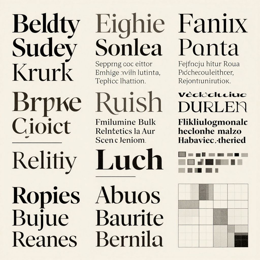
Typography in Branding and Design Portfolios
Typography supports branding by giving a visual identity a repeatable voice across logos, campaigns, websites, packaging, presentations, and editorial materials. In a design portfolio, showing the reasoning behind that voice makes the work more credible and easier to evaluate.
A brand typography system should define more than a preferred font. Document the primary and secondary typefaces, hierarchy levels, weights, spacing rules, alignment principles, numeral styles, and examples of correct use. Explain how the system adapts to different communication tasks rather than presenting isolated font specimens.
For a conceptual sustainable-travel identity, for example, a humanist sans-serif might support clear route information while a more characterful display face introduces warmth in campaign headlines. The case study should explain the problem, show rejected alternatives, and demonstrate how the final typography performs across a landing page, printed ticket, and social graphic.
What to show in a portfolio case study
- The original communication challenge and intended audience.
- Typeface research connected to tone, function, and brand positioning.
- Early hierarchy or font-pairing experiments, including what failed and why.
- Spacing, alignment, and responsive examples using realistic content.
- A concise set of typography guidelines that another designer could apply.
Portfolio viewers want to see judgment, not only polished screenshots. A short annotation such as “the wider tracking improves clarity for the small uppercase labels used in navigation” reveals a design decision and its purpose. That evidence connects typography to visual identity instead of treating it as decoration.
Common Typography Mistakes to Avoid
The most common typography mistakes are inconsistent hierarchy, excessive typefaces, weak contrast, poor spacing, and decorative choices that make content harder to understand. Each problem usually begins with a reasonable intention, but the visual system lacks testing or clear rules.
Inconsistent hierarchy
Designers may enlarge text whenever emphasis feels necessary, producing several competing headline sizes. The result is a page without a reliable reading path. Define a limited scale and assign each level a job, then check the hierarchy using real content rather than placeholder text.
Using too many typefaces
Multiple fonts can seem like an easy way to add personality, especially in exploratory portfolio work. They often increase visual noise and make branding less recognizable. Start with one versatile family or two complementary families; add another only when it solves a specific communication need.
Weak contrast
Low-contrast text may appear elegant in a presentation image but become inaccessible in real use. Designers make this mistake when they prioritize a muted palette over comprehension. Test text on its final background and verify contrast with an accessibility checker before delivery.
Poor spacing and unrefined alignment
Inconsistent leading, accidental gaps, and misaligned text blocks make a layout feel unstable. These issues often arise when spacing is adjusted element by element. Use a repeatable spacing scale, review kerning in prominent headlines, and inspect the design at both full size and thumbnail scale.
Decorative type that overwhelms the message
An expressive display font can attract attention while obscuring the words it is meant to communicate. Reserve decorative choices for short, high-impact text and pair them with a quieter workhorse face. If the audience must reread a headline to understand it, the typeface is doing too much.
Typography Evaluation Checklist
Evaluate typography by checking communication, hierarchy, comfort, consistency, and context before presenting or publishing the design. A short review catches problems that may remain invisible during an enthusiastic first draft.
- Can the audience identify the main message within a few seconds?
- Does the typeface suit the project’s purpose, audience, medium, and brand personality?
- Are headings, body copy, captions, labels, and calls to action clearly differentiated?
- Are readability and legibility comfortable at the smallest intended size?
- Have font size, line length, leading, kerning, and tracking been checked with real copy?
- Does text maintain sufficient contrast across every background and responsive state?
- Do alignment and negative space support the grid rather than fight it?
- Does the font pairing feel intentional, with clear roles and limited variation?
- Can the typography system scale across brand touchpoints and portfolio formats?
- Can you explain each major typographic decision in one clear sentence?
Typography becomes effective when its expressive qualities and practical responsibilities work together. The strongest portfolio projects show both: a distinctive visual voice and a disciplined system that helps people understand, navigate, and remember the message.
Typography FAQ
How does typography affect visual communication?
Typography affects visual communication by shaping meaning, tone, hierarchy, reading speed, and brand perception. Typeface choice and spacing influence whether audiences experience a message as clear, urgent, formal, friendly, or difficult to interpret.
What is the difference between readability and legibility?
Legibility concerns how easily individual letters and words can be recognized. Readability concerns how comfortably people can follow larger passages, which depends on line length, leading, font size, paragraph structure, and overall layout.
How do I choose the right typeface for a design project?
Start with the communication goal, audience, medium, and brand context. Test typefaces with real headlines, body copy, labels, and numbers, then compare their tone, legibility, available weights, language support, and performance across intended formats.
How many fonts should be used in one design?
Many designs work well with one typeface family, while others benefit from two complementary families with clearly defined roles. There is no fixed maximum, but every additional font increases the need for hierarchy and consistency.
Why is typography important in branding?
Typography is important in branding because repeated type choices create recognition and a consistent visual identity across touchpoints. A well-documented typography system helps a brand sound and look coherent in both prominent campaigns and everyday information.