Color Theory Basics: How to Choose the Perfect Palette

Color can attract attention, organize information, and give a design its character before a viewer reads a single word. The challenge is choosing colors with enough relationship and contrast to work as a system rather than as isolated swatches.
Color theory offers a practical way to make those decisions. It helps you move from a vague reference image to a palette with a clear dominant color, supporting tones, useful accents, and accessible neutrals.
What Is Color Theory?
Color theory is a framework for understanding how colors relate, combine, and behave in visual design. It helps designers create color harmony, establish hierarchy, and make intentional choices for brands, interfaces, illustrations, and portfolio projects.
Color theory is not a set of rigid rules. A palette can break conventional harmony and still succeed if its contrast, hierarchy, and context are deliberate. The useful question is not whether a color is attractive on its own, but what role it plays beside every other color in the composition.
Designers use color theory to answer practical questions:
- Which color should viewers notice first?
- How can a brand feel energetic without becoming visually exhausting?
- Which background and text combinations remain readable?
- How can a small accent guide interaction without competing with the main message?
Color also carries associations, but these associations depend on culture, industry, audience, lighting, surrounding colors, and personal experience. Treat color psychology as a design hypothesis to test, not as a universal rule. A deep blue may suggest trust in one context, while a different audience may read it as formal or distant.
Understanding the Color Wheel
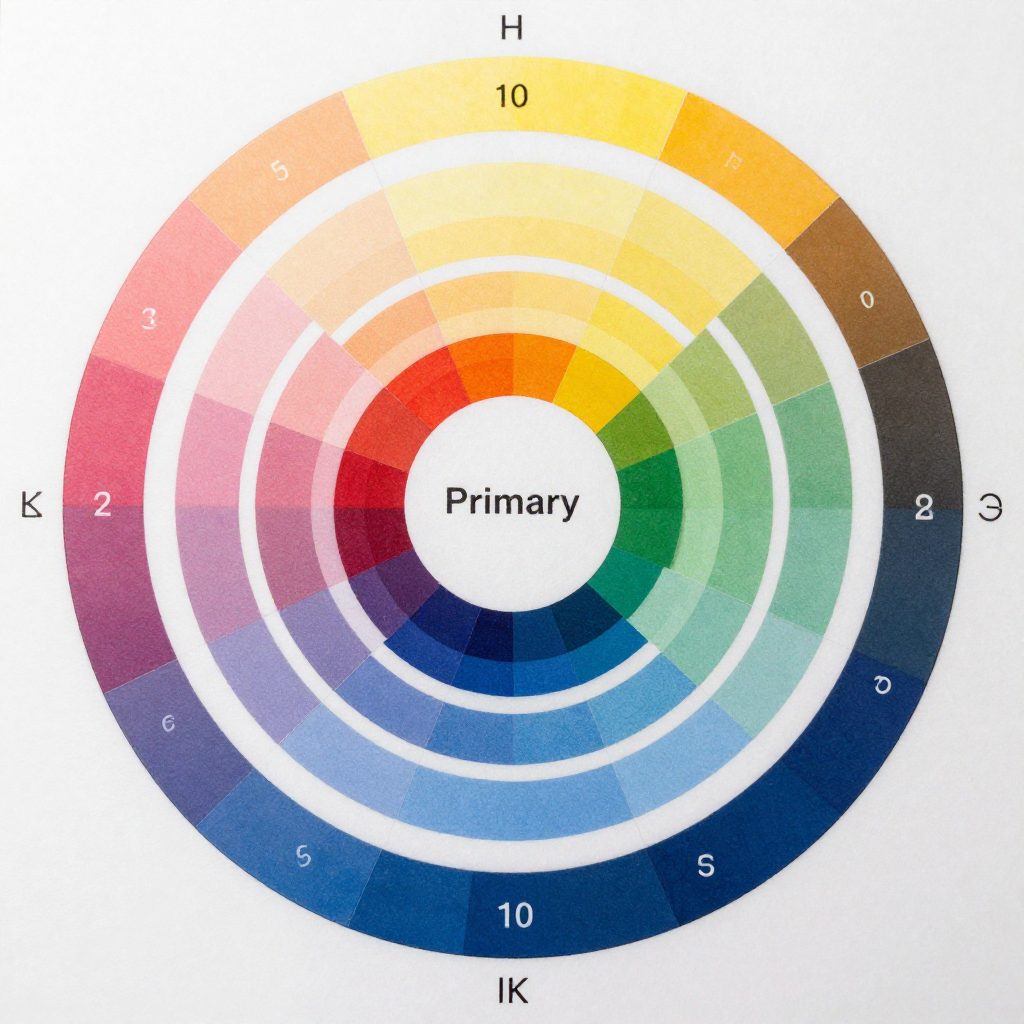
The color wheel maps relationships between hues, making it easier to identify harmonious combinations and deliberate contrasts. It commonly groups colors as primary, secondary, and tertiary colors.
In the traditional art-based model, the primary colors are red, yellow, and blue. Mixing two primary colors produces secondary colors: orange, green, and violet. Tertiary colors sit between a primary and a secondary color, creating names such as yellow-green, blue-violet, and red-orange.
Digital design often uses the RGB color model, where red, green, and blue light combine to produce colors on screens. The traditional color wheel remains useful for visual relationships, but the technical behavior of color changes between screen, print, paint, and different viewing conditions.
Hue, saturation, and value
Hue means the color family itself, such as blue or orange. Saturation describes intensity: a highly saturated blue appears vivid, while a desaturated blue looks muted or grayish. Value describes lightness or darkness.
These three properties explain why two colors with the same hue can feel completely different. A pale, low-saturation blue may work as a background, while a dark, saturated blue may function as a headline color or navigation element.
When evaluating a palette, convert it mentally or digitally to grayscale. If every color has a similar value, the design may lose hierarchy even when the hues look different. This simple check reveals whether the palette has enough structural contrast.
Common Color Schemes and Color Harmony
Color harmony describes a pleasing or purposeful relationship among colors. Common color schemes provide starting points, but their success depends on proportion, value, saturation, and the job each color performs.
Complementary colors
Complementary colors sit opposite each other on the color wheel, such as blue and orange or violet and yellow. They create strong contrast and are effective when a design needs a clear focal point. Use one color as the dominant field and the other as a restrained accent; equal amounts can feel noisy.
Analogous colors
Analogous colors sit next to one another, such as green, blue-green, and blue. They usually create a calm, cohesive palette because the hues share visual qualities. This scheme works well for editorial layouts, environmental brands, illustrations, and interfaces that need continuity rather than dramatic tension.
Monochromatic palettes
A monochromatic palette uses one hue across several values and saturation levels. It is easy to coordinate and can look polished, but it needs strong light-dark variation to avoid appearing flat. A single hue with five nearly identical tones will not create enough hierarchy.
Triadic color schemes
A triadic color scheme uses three hues spaced evenly around the color wheel. Triadic palettes can feel lively and balanced, especially in illustrations, educational products, and playful identities. Choose one dominant color and reduce the saturation or area of the other two to maintain control.
Split-complementary palettes
Split-complementary palettes pair a base color with the two hues beside its complement. They provide contrast with more flexibility than a direct complementary scheme. This is a useful option when a single opposite color feels too aggressive but the design still needs a noticeable accent.
Think of these schemes as structural templates. They do not determine the final palette. Adjusting value, saturation, and proportion often matters more than selecting the relationship alone.
How to Build a Cohesive Color Palette
To build a cohesive color palette, choose a dominant color first, add supporting colors by relationship, reserve an accent for priority actions, and use neutrals to create space and legibility.
A repeatable process prevents inspiration from becoming random color collecting. Use this sequence for a brand identity, website, interface, illustration, or case study:
- Define the design job. Write three practical goals, such as approachable, precise, and easy to scan. Also identify the audience, medium, and viewing conditions.
- Choose a dominant color. Start with the hue that best represents the project’s visual direction. It may appear in a logo, hero area, illustration, or navigation system.
- Add supporting colors. Select one to three related hues using an analogous, complementary, triadic, or split-complementary relationship. Test them at different values rather than using every color at full strength.
- Assign an accent color. Use the accent for a small number of high-priority elements, such as a call-to-action, active state, badge, or key detail in an illustration.
- Build a neutral range. Include background, surface, border, body-text, and strong-text neutrals. Neutrals do more structural work than many designers expect.
- Test the system in context. Place the palette on actual cards, pages, logos, buttons, headings, and images. A swatch sheet alone cannot reveal interaction problems.
A practical palette often contains six to ten functional colors, although the visible design may use fewer. Name colors by role, such as background, surface, text, primary, and accent, rather than relying only on names such as blue or coral. Role-based naming makes the system easier to maintain when the palette evolves.
Choosing a bold accent for attention means accepting that it should appear sparingly. If every button, headline, illustration, and border uses the accent, nothing remains visually important.
Using Contrast, Mood, and Context
Contrast creates hierarchy by separating elements through differences in value, hue, saturation, size, or space. Color associations influence mood, but context determines whether a palette feels readable, appropriate, and consistent.
Value contrast is usually the most dependable tool for legibility. A dark text color on a light background remains recognizable even when the hue relationship is subtle. Hue contrast can attract attention, but two bright colors with similar value may vibrate or become difficult to distinguish.
Use contrast intentionally across a hierarchy:
- High contrast for primary headings, key actions, and essential information.
- Medium contrast for supporting labels, secondary navigation, and illustrations.
- Low contrast for quiet surfaces, dividers, and decorative details, provided they do not carry essential meaning.
Mood should follow the project’s context. A financial dashboard may need a restrained palette that supports concentration, while a children’s learning app may tolerate brighter colors and stronger variation. Neither approach is automatically better. The correct choice depends on audience expectations, content density, brand personality, and the time users spend looking at the design.
Review colors in their real environment. A palette that works on a bright design canvas may appear too dark on a mobile screen at night. Images, typography, white space, and neighboring colors can also change how a swatch is perceived.
Color Accessibility and Common Mistakes
Color accessibility means ensuring that people can read, navigate, and understand a design without depending on color alone. Check text contrast, provide non-color cues, and test combinations for common forms of color vision deficiency.
For web projects, the Web Content Accessibility Guidelines provide widely used recommendations for contrast and perceivable content. A common WCAG reference point is a contrast ratio of at least 4.5:1 for normal body text and 3:1 for large text, subject to the applicable conformance criteria.
Common mistakes to avoid
- Using color as the only signal. People may miss an error state shown only in red or a selected tab shown only in green. Add icons, labels, patterns, position, or text.
- Choosing attractive but low-contrast text. Soft gray text on a white background can look refined in a mockup while becoming tiring to read. Darken the text or increase the background difference.
- Overusing saturated colors. Maximum saturation everywhere creates visual fatigue and weakens hierarchy. Reserve intense colors for moments that deserve attention.
- Ignoring color vision differences. Red-green combinations can become difficult to distinguish for some users. Add value contrast and test with a simulator or accessibility tool.
- Applying colors inconsistently. If the same orange means a button in one screen and a warning in another, users must relearn the interface. Define roles and document them.
Accessibility often improves the design for everyone. Clearer value contrast, redundant cues, and consistent roles make interfaces easier to scan in glare, low light, or stressful conditions.
Applying Color Theory to Portfolio Projects
Apply color theory to portfolio projects by documenting the palette’s purpose, relationships, accessibility checks, and real-world applications. A case study becomes stronger when it explains decisions rather than displaying attractive swatches alone.
Show the palette as a working system. For a branding project, present the logo, color roles, typography, packaging, and digital touchpoints together. For a website or UI project, show primary and secondary buttons, hover states, forms, alerts, cards, and responsive screens.
Include a short rationale for each role:
- Dominant color: establishes recognition and controls the main visual field.
- Supporting colors: create variation across sections, illustrations, or content categories.
- Accent color: directs attention to actions or selected states.
- Neutrals: provide readable text, backgrounds, surfaces, borders, and breathing room.
Then show evidence. Include a grayscale test, contrast-check results, color-blind simulation, or before-and-after comparison when relevant. These details demonstrate design judgment and make the portfolio work easier for reviewers to evaluate.
One useful case-study format is intent, system, evidence. State what the project needed, explain how the palette solved that need, and show the result in context. This approach turns color selection from decoration into a visible design decision.
Frequently Asked Questions
What are the basic color schemes?
The basic color schemes include complementary, analogous, monochromatic, triadic, and split-complementary palettes. Each describes a different relationship on the color wheel and can be adjusted through value, saturation, and proportion.
How many colors should a design palette include?
Many projects work well with one dominant color, one or two supporting colors, one accent, and several neutrals. The exact number depends on the design system, but every color should have a clear role.
How do I choose an accent color?
Choose an accent that contrasts with the dominant color and remains readable in its intended use. Test it on buttons, links, active states, and small details, then limit its frequency so it retains emphasis.
What is the difference between hue, saturation, and value?
Hue is the color family, saturation is the intensity or purity of the color, and value is its lightness or darkness. Adjusting these properties can change hierarchy and mood without changing the basic hue.
How can I make a color palette more accessible?
Use sufficient text contrast, avoid relying on color alone, add labels or icons, test common color vision differences, and review the palette in real interface states. Accessibility should be checked throughout the design process, not only at the end.