10 Essential Design Principles Every Artist Should Master
Every strong piece of visual work — whether it's a brand identity, an illustrated poster, or a fine art painting — rests on the same underlying structure. These aren't arbitrary rules handed down from design schools. They're patterns that reflect how human vision actually works: what draws attention, what creates tension, what feels resolved. Understanding them doesn't constrain your creativity. It gives you the vocabulary to make deliberate choices instead of accidental ones.
Why Design Principles Matter for Artists and Designers
Design principles matter because they give you a shared language for evaluating your own work — and for explaining decisions to clients. Without them, feedback becomes subjective noise: "something feels off" with no path to fixing it. With them, you can diagnose exactly what's creating visual tension or why a layout isn't landing.
For working artists building a portfolio, these principles are doubly important. Your portfolio isn't just a collection of work — it's itself a designed object. The way pieces are sequenced, spaced, and presented communicates professionalism before a viewer even looks closely at the work itself.
These principles also apply across disciplines. A muralist, a UI designer, and a book cover illustrator are all solving the same core problem: directing attention through a two-dimensional surface. The tools differ; the underlying logic doesn't.
Visual Hierarchy and Composition — Guiding the Viewer's Eye
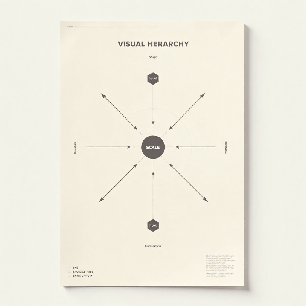
Visual hierarchy is the system you use to tell viewers what to look at first, second, and third. Composition is how you arrange all elements within the frame to support that sequence. Together, they determine whether a piece feels purposeful or chaotic.
Scale is the most direct lever. A large element reads before a small one — almost every time. But placement matters just as much. An element positioned at the optical center of a composition (slightly above the geometric center) naturally draws the eye. Elements placed at the edges feel secondary unless they're deliberately pulling tension toward the frame boundary.
Focal points anchor a composition. Most strong designs have one primary focal point and one or two secondary ones. The primary focal point carries the main message; secondary focal points give the eye somewhere to travel after. When everything in a composition competes equally for attention, the viewer's eye has nowhere to rest — and they disengage.
A practical test: squint at your work until it blurs. The shapes that remain visible are your dominant elements. If those shapes don't match your intended hierarchy, your composition needs adjustment.
Balance, Contrast, and Alignment — The Structural Backbone of Good Design
These three principles work as a system. Balance determines weight distribution; contrast creates distinction between elements; alignment builds the invisible grid that holds everything together.
Balance: Symmetrical vs. Asymmetrical
Symmetrical balance places equal visual weight on both sides of a central axis. It reads as stable, formal, and authoritative — useful for logos, institutional work, and compositions where trust is the primary message. Asymmetrical balance distributes different elements of different sizes to achieve equilibrium without mirroring. It feels dynamic and modern, but requires more deliberate control. A large, light-colored shape can balance a small, dark one — because visual weight isn't just about size.
Contrast
Contrast is what makes elements distinguishable from each other. High contrast between a headline and its background improves readability. High contrast between a subject and its environment draws focus. Low contrast creates subtlety and cohesion — but too little contrast produces muddy, unreadable work. The mistake most artists make is applying contrast only to color, when it applies equally to size, texture, shape, and value.
Alignment
Nothing undermines a design faster than misaligned elements. Even a 3-pixel offset between two text blocks signals carelessness to a trained eye. Alignment doesn't mean everything must line up to the same edge — it means every element has a deliberate relationship to something else in the composition. Use grids, guides, and snap functions in digital tools. In traditional work, sketch your underlying structure before committing.
Color Theory and the Power of Contrast
Color theory gives you a framework for predicting how color relationships will affect mood, readability, and visual impact before you commit to a palette. The three core relationships to know are complementary, analogous, and triadic color schemes.
Complementary colors (opposite on the color wheel, like blue and orange) create maximum contrast and vibration. They're energetic and attention-grabbing, but can feel aggressive if not balanced with neutral tones. Analogous colors (adjacent on the wheel, like yellow, yellow-green, and green) feel harmonious and natural — good for work where you want the viewer to linger rather than react. Triadic schemes use three colors equally spaced around the wheel; they're inherently balanced and visually rich, but require discipline to execute without chaos.
Beyond hue, pay attention to value (lightness/darkness) and saturation (intensity). Two colors can be harmonious in hue but clash violently in saturation. A desaturated palette with one saturated accent is a reliable way to create emphasis without visual noise.
For a deeper grounding in color science, the International Color Consortium publishes technical standards and resources that serious designers find useful for understanding how color behaves across different media and output formats.
Typography as a Design Element
Typography is a design element, not just a delivery mechanism for words. For artists building portfolios or creating mixed-media work, type choices communicate personality and reinforce visual identity as powerfully as any illustration or color palette.
The basic decisions — serif vs. sans-serif, weight, tracking, leading — each carry associations. Tight tracking feels dense and contemporary. Generous leading feels editorial and considered. A heavy slab serif signals confidence and weight; a thin geometric sans-serif signals precision and modernity. None of these are objectively better. They're tools, and the question is always: does this choice reinforce what the work is trying to say?
For portfolio layouts specifically, limit yourself to two typefaces maximum — one for headings, one for body text. Typographic restraint reads as confidence. Using five different fonts to "add personality" usually produces visual noise instead.
Type also participates in hierarchy. Size, weight, and color all signal importance. A bold headline at 48pt, a subheading at 18pt, and body copy at 12pt create a clear reading sequence without any other visual cues. When your type hierarchy is working, a viewer knows exactly where to start reading without being told.
White Space, Repetition, and Unity — Tying It All Together
White space — often called negative space — is the area in a composition that contains no active elements. It's not empty; it's structural. It gives elements room to breathe, separates distinct sections, and directs attention by creating contrast between active and passive areas.
The most common mistake working artists make with white space is treating it as wasted real estate. Filling every corner of a composition or portfolio page signals anxiety, not abundance. Generous white space around a strong piece of work signals that you trust the work to hold attention on its own. That confidence reads immediately to viewers and clients.
Repetition and pattern create cohesion. When a visual motif — a color, a shape, a texture, a typographic treatment — appears consistently across a piece or a portfolio, it signals intentionality. The viewer's brain recognizes the pattern and reads the work as unified rather than assembled from unrelated parts. This is how a portfolio of stylistically diverse work can still feel like it comes from a single creative voice.
Unity and harmony are the result when all the other principles are working together. A unified composition doesn't mean every element matches — it means every element belongs. Harmony allows for contrast, tension, and variety within a coherent whole. It's the difference between a collection of interesting parts and a piece that works as a single, resolved statement.
How to Apply These Principles to Your Portfolio and Client Work
Knowing these principles is one thing. Applying them under deadline pressure, with client feedback pulling in multiple directions, is another. The most useful shift is treating these principles as a diagnostic checklist rather than a creative constraint.
When a piece isn't working, run through the list systematically. Is the visual hierarchy clear — does the viewer know where to look first? Is the balance intentional — if it feels unstable, is that instability serving the work or undermining it? Is there enough contrast to make the key elements readable? Is the color palette coherent, or are there rogue hues that snuck in from a previous iteration?
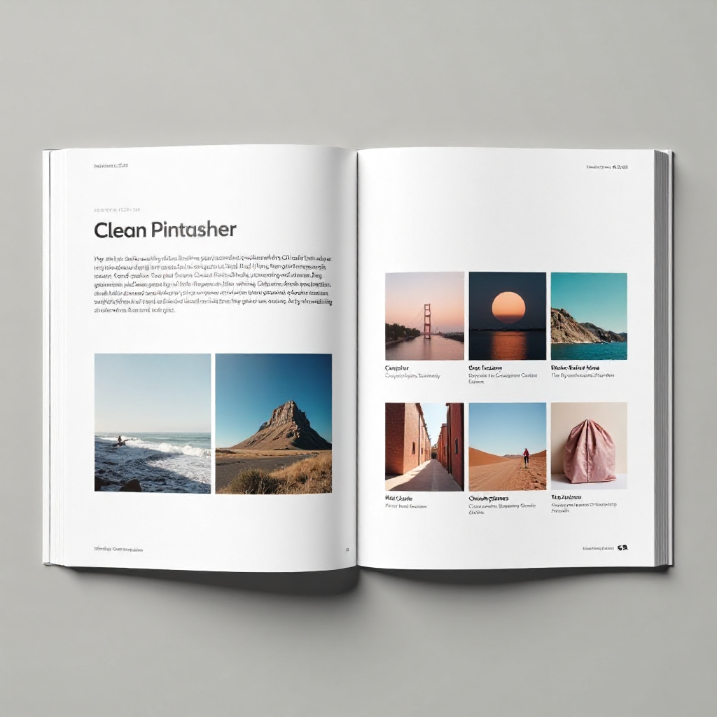
For portfolio layout specifically, apply the same rigor you'd bring to a client project. Choose a consistent grid. Use alignment to create visual rhythm between pieces. Use white space to let strong work breathe. Apply repetition in your typography and color treatment so the portfolio reads as a designed object, not just a gallery dump.
Client work adds another layer: the principles become a communication tool. When a client asks you to "make it pop" or "add more energy," you can translate that into specific decisions — increase contrast, shift the color temperature, tighten the hierarchy. That translation from vague feedback to specific action is one of the most valuable skills a working designer or commercial artist can develop.
The Interaction Design Foundation's visual design resources offer well-structured references for designers who want to go deeper on any of these principles with research-backed context.
Frequently Asked Questions
What is the most important design principle for beginners to learn first?
Visual hierarchy is the highest-leverage starting point. Once you can control where a viewer's eye goes — and in what sequence — every other principle becomes easier to apply. Composition, balance, and contrast all serve the hierarchy. Start there.
Do fine artists need to follow the same design principles as graphic designers?
Yes and no. Fine artists have more license to break conventions deliberately, but the principles still govern how viewers experience the work. A painter who understands visual hierarchy and color theory makes more intentional choices — even when those choices involve breaking the rules. The principles apply; the degree of adherence varies by context and intent.
How do design principles apply to digital vs. traditional art?
The principles themselves don't change — but the tools for applying them differ. Digital work gives you grids, guides, and undo buttons; traditional work demands more upfront planning. In both cases, the underlying logic of hierarchy, balance, contrast, and unity operates the same way. The medium changes the execution, not the framework.
Can breaking design rules ever work in your favor?
Absolutely — but only when you understand the rule well enough to know what you're breaking and why. Intentional rule-breaking creates tension, surprise, or emphasis. Accidental rule-breaking just looks like a mistake. The difference is visible to anyone with a trained eye, which is exactly why learning the rules first matters.
How can I use design principles to improve my portfolio layout?
Treat your portfolio as a design project with the same rigor you'd apply to client work. Establish a consistent grid for alignment. Use white space generously around strong pieces. Apply repetition in typography and color to create cohesion across diverse work. Make sure the sequencing creates a clear narrative arc — your best work first, your second-best piece last, and a logical progression in between.